They tell you that you need another LUT. That you need more contrast. What you’re really chasing is the need to feel more cinematic. But today, I’m telling you to stop grading what you see, and start grading what you want people to feel.
Workflow efficiency in color grading comes from using tools that combine multiple functions into a unified system. According to Blackmagic Design, DaVinci Resolve’s node-based architecture allows colorists to build efficient pipelines that minimize repetitive work and maximize creative time.
For advanced techniques on emotion-driven grading, Mixing Light offers professional tutorials from industry colorists who specialize in storytelling through color.
I spent 10 years thinking color grading was just a technical skill. Getting skin tones perfect. Matching shots. Hitting Rec.709. But here’s the brutal truth. All of it matters, but none of it moves anyone.
The first time I actually made someone cry with a color grade, it wasn’t because my teal and orange were mathematically perfect. It was because I desaturated the entire cold scene and saved warmth for her hands, the only warm thing left on screen. The audience didn’t know why they were reacting. They just did.
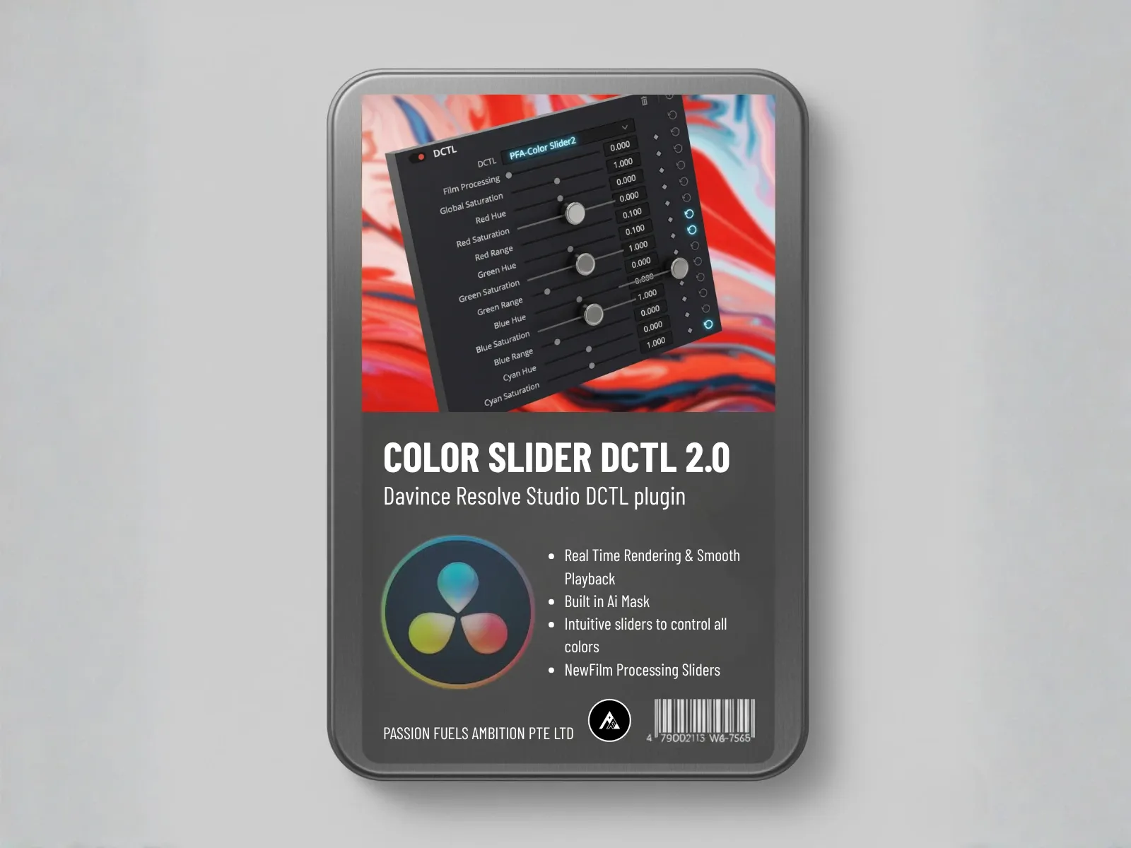
Today I’m going to show you how to engineer that exact kind of emotion using specific technical choices in PFA Color Suite. We’re going to reshape the entire mood of shots using just one tool in one single node.
If you’re still learning the fundamentals of color grading, check out our complete guide on what color grading actually is and how the workflow works. Understanding the technical foundation is what makes the emotional layer possible.
The Difference Between a Grade That Looks Good and One That Moves People
Most colorists approach grading with a visual target. A reference still. A screenshot from a film. They try to match the histogram, the vectorscope positions, the contrast ratio. And on paper, it looks right.
But the audience doesn’t feel anything.
The reason is simple. You’re grading for what looks correct instead of what feels correct. Roger Deakins doesn’t pick color temperatures because they look good on a monitor. He picks them because they make you lean forward or lean back. Color psychology research confirms that warm and cool tones trigger measurable physiological responses in viewers. He’s grading for physiological response, not pixel accuracy.
Emotional color grading is the practice of choosing your palette, your contrast, and your saturation based on the psychological impact you want to create. It starts with a question before you touch a single node: what should the audience feel in this moment?
Step 1: Start with a Neutral Canvas (De-Logify)
Before you can inject emotion, you need a clean foundation. Most colorists reach for the Color Space Transform node in DaVinci Resolve to convert their LOG footage to Rec.709. Here’s the problem. Standard CST introduces unwanted saturation shifts during the conversion itself. As documented in Blackmagic Design’s DaVinci Resolve documentation, proper color space management is critical for maintaining color fidelity throughout the grading pipeline.
In PFA Color Suite 10.2, we’ve completely eliminated the need to rely on broken color space transforms.
Go to De-Logify, turn on the input guide, increase the exposure until the details snap in, increase the De-Logify until you see most of the details, and close it. Before and after, you get a perfectly reverse-engineered correction from LOG to a workable foundation.
Here’s the secret: all the saturation is preserved. If you try to do this the traditional way using a standard Color Space Transform from ARRI LogC4 to Rec.709 Gamma 2.4, watch what happens. You get a dramatic shift in saturation introduced by the CST itself. Your starting point is already wrong, and every creative decision you build on top of it inherits that error.
As colorists, we want a neutral foundation that preserves our color fidelity for the later stages. PFA Color Suite revolutionizes this process with just simple sliders. But don’t let the simplicity fool you. The De-Logify slider alone runs on over 500 lines of complex code. Fine-tune your exposure, use the white balance guide on your white pixels, and with just three sliders you have a perfectly neutral canvas.
Understanding the difference between color correction and color grading is critical here. De-Logify gives you the correction. The emotional choices come next.
Step 2: Inject Feeling with Film Density
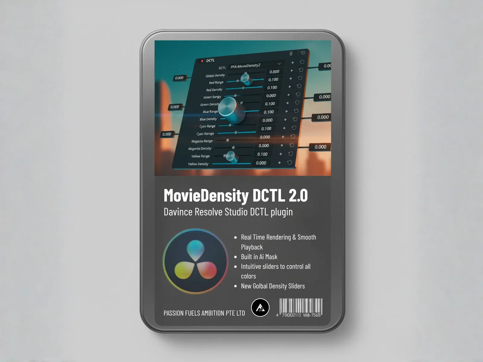
Before you build a look, you need film density. Watch the scopes as I increase global density. The image gets more saturated, but look at the RGB luminance on the RGB parade. It actually drops.
This is the magic of subtractive color science. As you add more color dye, it blocks more light. Digital grading typically uses additive color, which makes images look brighter and more processed. Subtractive grading mimics the physics of actual film stock, where adding color density darkens the image while enriching the saturation.
For a deeper dive into how subtractive color works, read our breakdown of subtractive film emulation and why it creates that authentic cinematic density. This is how you get that rich, authentic film saturation that digital grading struggles to replicate.
Step 3: Define the Palette with Film Mixer
Next, we move to Film Mixer. This is where we define the palette for our emotional color grading. Let’s establish a teal and pink look.
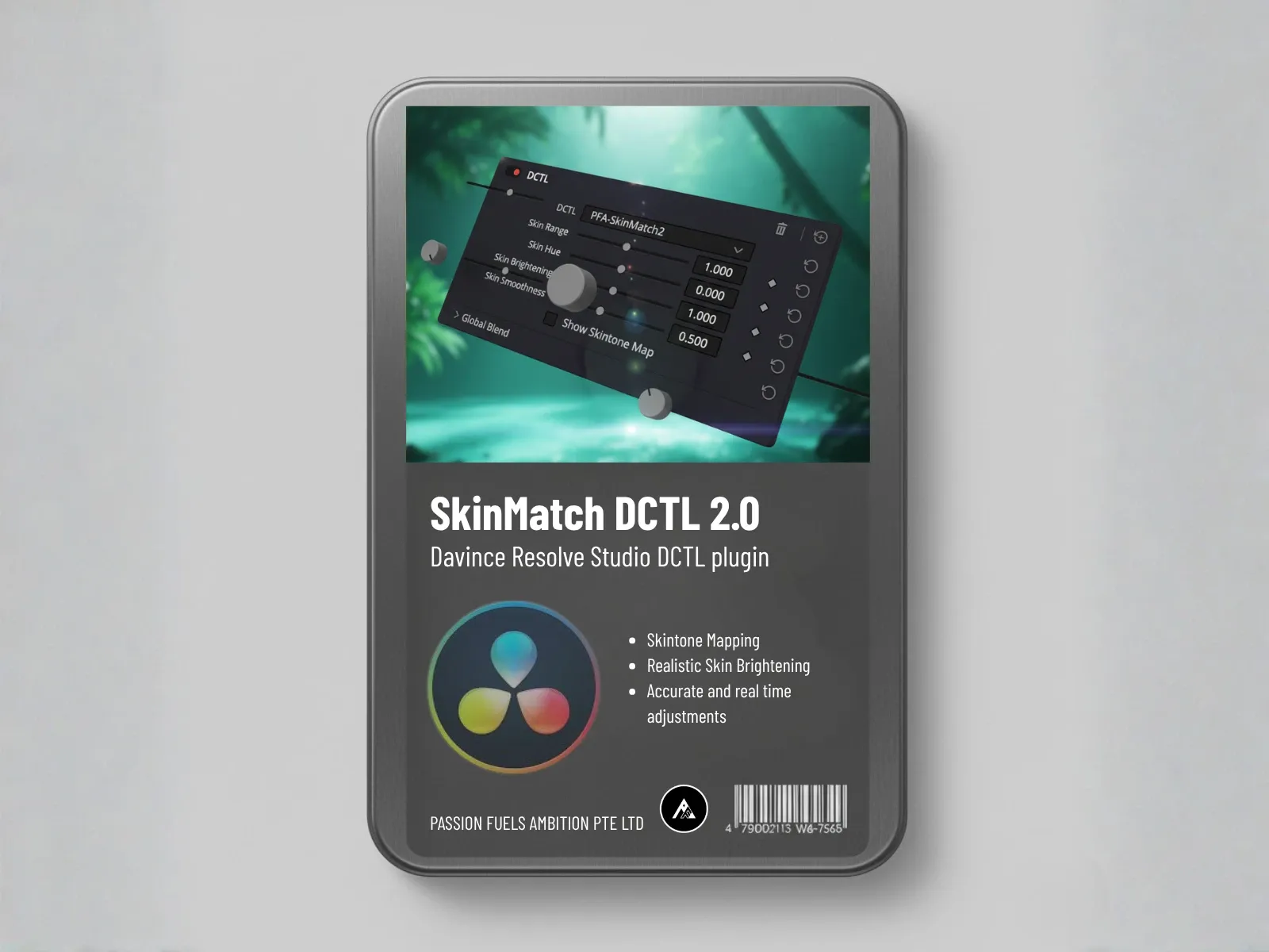
With one slider, we massage the entire vectorscope into a linear, complementary color set. And it works flawlessly because of built-in skin tone protection. Without this, your subject’s skin gets dragged into the shift, which is exactly what happens with standard channel mixer tools even in DaVinci Resolve. With PFA Color Suite, the skin is perfectly preserved.
Emotion Demo 1: Nostalgic Warmth
Ask yourself, how do you want the audience to feel right now? For nostalgic warmth, we add more yellow. Yellow on the vectorscope sits opposite of blue. So we shift the blue output in the opposite direction. Instantly we inject a nostalgic warmth by pulling yellow into the hue. The scene feels like a memory, even if nothing else changed.
Emotion Demo 2: Cold and Emotionless
Cyan is the opposite of red. Move the red slider away from red, and the whole thing turns out instantly chilling. The audience feels the isolation without knowing why. This is the kind of grade you use for scenes where the character is emotionally disconnected from their environment.
Emotion Demo 3: Toxic and Eerie
Increase the green output, massaging all the magenta into green. The scene becomes unsettling. Green pushes the image toward sickliness, toward unease. You’re not guessing at what feels right anymore. You’re engineering it.
Why Film Mixer Works Differently Than Standard Tools
Because Film Mixer uses an advanced 32-bit float mask system, it doesn’t rely on massive pixel selection or power-hungry GPU processing. It’s doing pure channel math at the pixel level. Whether your footage is 8-bit, 10-bit, or raw LOG, it doesn’t matter. The math works the same way across every format.
That’s why you get live playback at 4K RAW 30fps while making real-time adjustments. Twenty parameter changes on a single node, no stuttering, no dropping frames. The tools should disappear between your intention and the screen.
Step 4: Inject Colors That Weren’t on Set (Film Printer Lights)
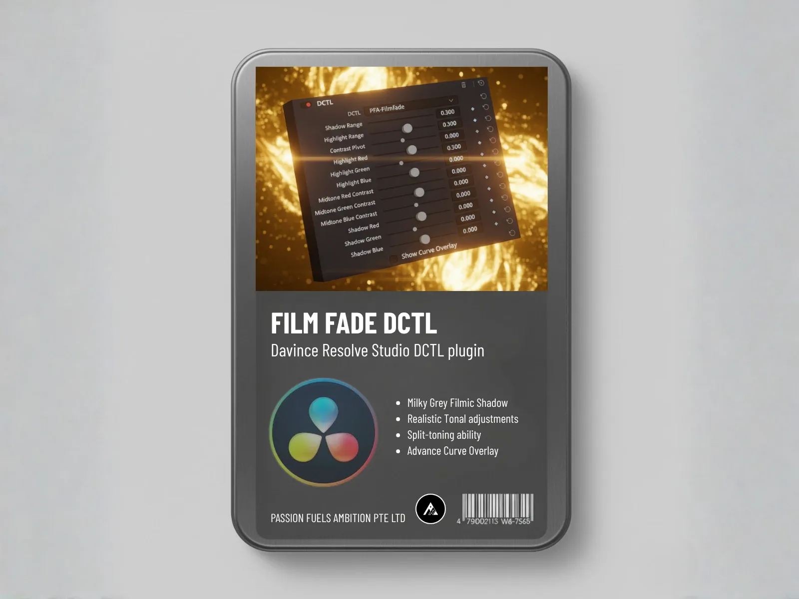
But what if you want to inject a color that was never even recorded on set? In a traditional film lab, they shine RGB lights across film strips to burn in the color ink. We recreated this process with Film Printer Lights.
Here’s the game changer. Look at the shadow protection and skin protection sliders. Turn on the mask and you’ll see exactly how it works. Like a luminance-based mask, isolating your subject and the shadows, but without any heavy computation. Your CPU and GPU stay cool while you work.
Want more violence at red? More eeriness at green? A golden hour match combining yellow and green? This is the Emotional Drive node, designed specifically for the finishing touch. You can play back at full speed while dialing in every adjustment live on the node.
The Result: One Node, Complete Emotional Transformation
In just one node, we completely reshaped the psychology of this shot. Not by stacking LUTs or chasing reference stills. By deciding what the scene should make people feel, and using the right tools to get there.
Everything you saw was built on PFA Color Suite 10.2. You can download the free trial of version 7.8 right now. We always keep the trial one version behind, but if you want the full power of 10.2, you need the license.
We’re running a 38% off promotion right now. Use the code thankyou2026 at checkout. Don’t miss this, because you’ll kick yourself when it’s gone.
Free PFA Color Suite Learning Platform
We’ve just launched a brand new learning management system dedicated to mastering PFA Color Suite. It’s completely free. Take the courses, learn every single feature at your own pace, and let us know how smoothly the system runs on your hardware so we can keep optimizing.
How Do You Build a Faster Color Grading Workflow?
Use plugins that cover the full grading pipeline in one interface, like PFA Color Suite. Organize your node tree so correction comes before creative grading, and use preset systems for consistent looks across projects. AI-assisted tools like Cinepulse AI can automate repetitive tasks, freeing you to focus on creative decisions.
Frequently Asked Questions
What is emotional color grading?
Emotional color grading is the practice of choosing your color palette, contrast, and saturation based on the psychological impact you want to create in the viewer. Instead of matching a reference image, you start by identifying the emotion of the scene and work backward to build a grade that triggers that response.
How do you grade for emotion instead of looks?
Start by asking what the audience should feel in this scene. Then use color temperature, saturation, and contrast to reinforce that feeling. Warm colors like yellow and red evoke comfort and nostalgia. Cool colors like cyan and blue create distance and isolation. Green shifts create unease. The technical choices follow the emotional intent.
What is subtractive color in color grading?
Subtractive color grading mimics the physics of film stock, where adding color density blocks light and creates richer, deeper saturation. Unlike additive digital grading that brightens the image, subtractive grading darkens while enriching, which is what gives film its characteristic look.
Does PFA Color Suite work with all camera formats?
Yes. PFA Color Suite uses 32-bit float math, so it works identically across 8-bit, 10-bit, 12-bit, and raw LOG footage from any camera. The De-Logify tool handles LOG to Rec.709 conversion without the saturation shifts that standard CST introduces.
Can I achieve emotional grading without plugins?
You can, but it requires significantly more manual work. Standard tools can achieve similar results, and understanding standards like ACES (Academy Color Encoding System) helps, but, but they lack the built-in skin tone protection, subtractive color science, and 32-bit float performance that PFA Color Suite provides in single-slider controls.
Passion Fuels Ambition. I’ll see you in the next grade.