The Impossible Avatar 3 Color Grade: How to Replicate Hollywood Density in DaVinci Resolve
🎨 Ready to Grade Like a Pro?
Transform your footage with professional color grading tools used by industry experts.
No credit card required • Unlimited access • Professional results
Why Your Saturation Slider Is Ruining Your Color Grades
You can download this free preset to load in your PFA color suite free trial!
You’ve spent hours grading your footage. The colors look vibrant. The image pops. But something feels off,it looks digital. Thin. Flat.
Most creators attempting to replicate the cinematic depth of Avatar 3 are making the same critical mistake: they’re relying on saturation.
Standard saturation adds brightness to your image, which makes colors look washed out and artificial. It’s the opposite of what Hollywood colorists do. The secret to the Avatar 3 look,and any professional-grade cinematic image,isn’t adding light. It’s adding weight.
This is called “Hollywood Density,” and it’s a subtractive color process that creates the visual depth that separates professional cinema from video content.
In this guide, I’ll break down the exact one-node grading workflow I used to reverse-engineer the Avatar 3 color grade from the official trailer. Using PFA Color Suite 3.5 in DaVinci Resolve, I’ll show you how to replicate this impossible-looking grade on your own footage,and I’m including my preset settings so you can download and apply them directly.
Understanding the Difference: Density vs. Saturation
Before we dive into the technical workflow, you need to understand the fundamental difference between these two approaches.
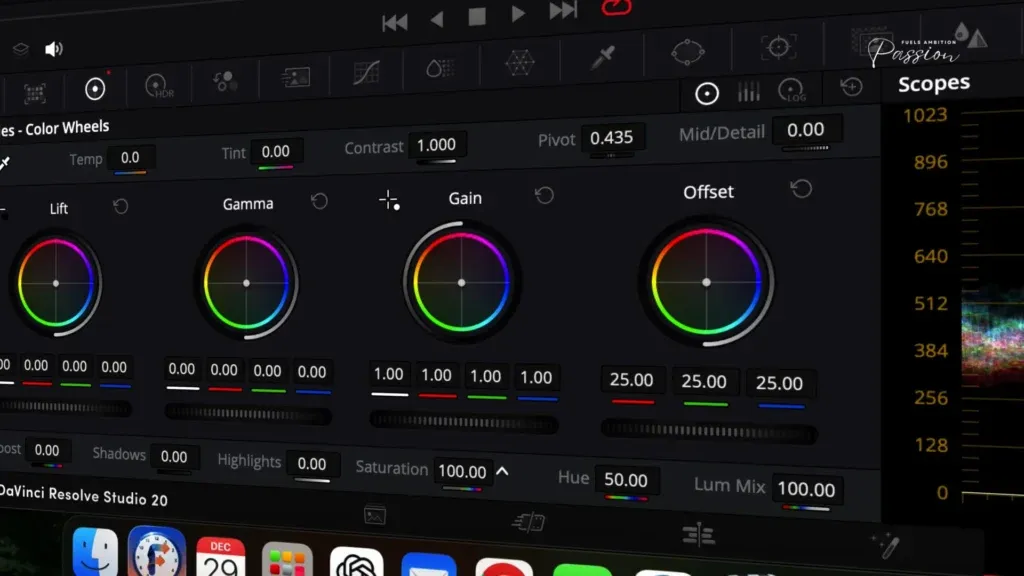
Saturation: The Digital Look
When you push the saturation slider in DaVinci Resolve’s standard color wheels, you’re adding brightness to the color signal. This creates a “thin” look,colors become vibrant but lose depth. The image feels flat and video-like.
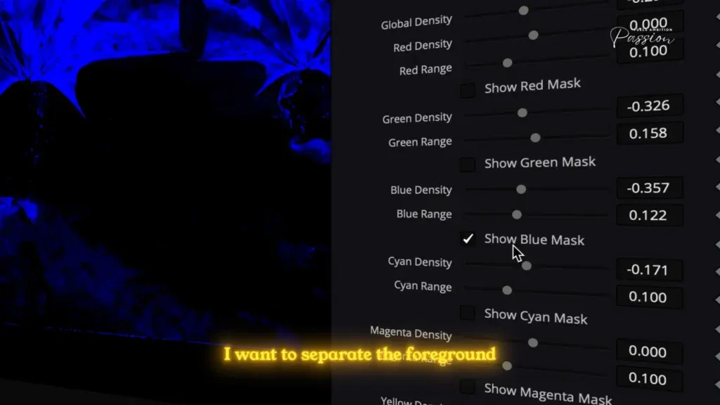
Density: The Cinematic Look
Density works the opposite way. Instead of adding brightness, it adds black to the color signal. This is a subtractive color process, similar to how film stock works. Every color gets grounded with depth, creating that thick, cinematic appearance you see in blockbuster films.
The key difference: Saturation = brightness + thinness. Density = depth + weight.
This is why you can never achieve the Avatar 3 look with standard saturation alone. You’re fighting against the physics of light.
The Professional Foundation: Color Space Setup
Before we touch any color grading tools, we need to establish the correct color space pipeline. This is where most creators go wrong.
Step 1: Set Your Timeline to DaVinci Wide Gamut
Start with your Log footage in DaVinci Resolve. Your timeline should be set to DaVinci Wide Gamut color space. This gives you the widest possible color information to work with,think of it as having more “headroom” for grading.
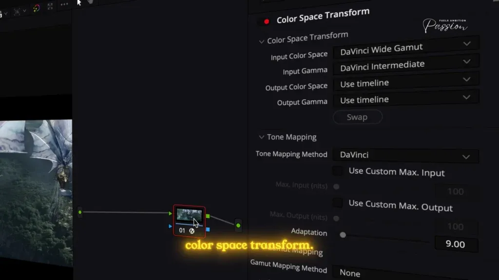
Step 2: Create Your Grading Node Before the Color Space Transform
Here’s the critical technical nuance: Create your PFA Color Suite grading node before the Color Space Transform (CST).
Why? If you apply effects after the CST, you’re technically grading inside a smaller box,Rec.709. By placing the node before, you’re grading based on the DaVinci Intermediate data, which is much wider and brighter. You want that extra headroom to push the colors without breaking the image.
Step 3: Output to Rec.709, Gamma 2.4
Once your grading is complete, apply the Color Space Transform to convert to Rec.709, Gamma 2.4. This ensures your image is properly calibrated for broadcast and streaming delivery.
The PFA Color Suite Workflow: A One-Node Solution
Now we’re ready to grade. The beauty of PFA Color Suite is that it consolidates five critical grading functions into a single node. Let’s walk through each one.
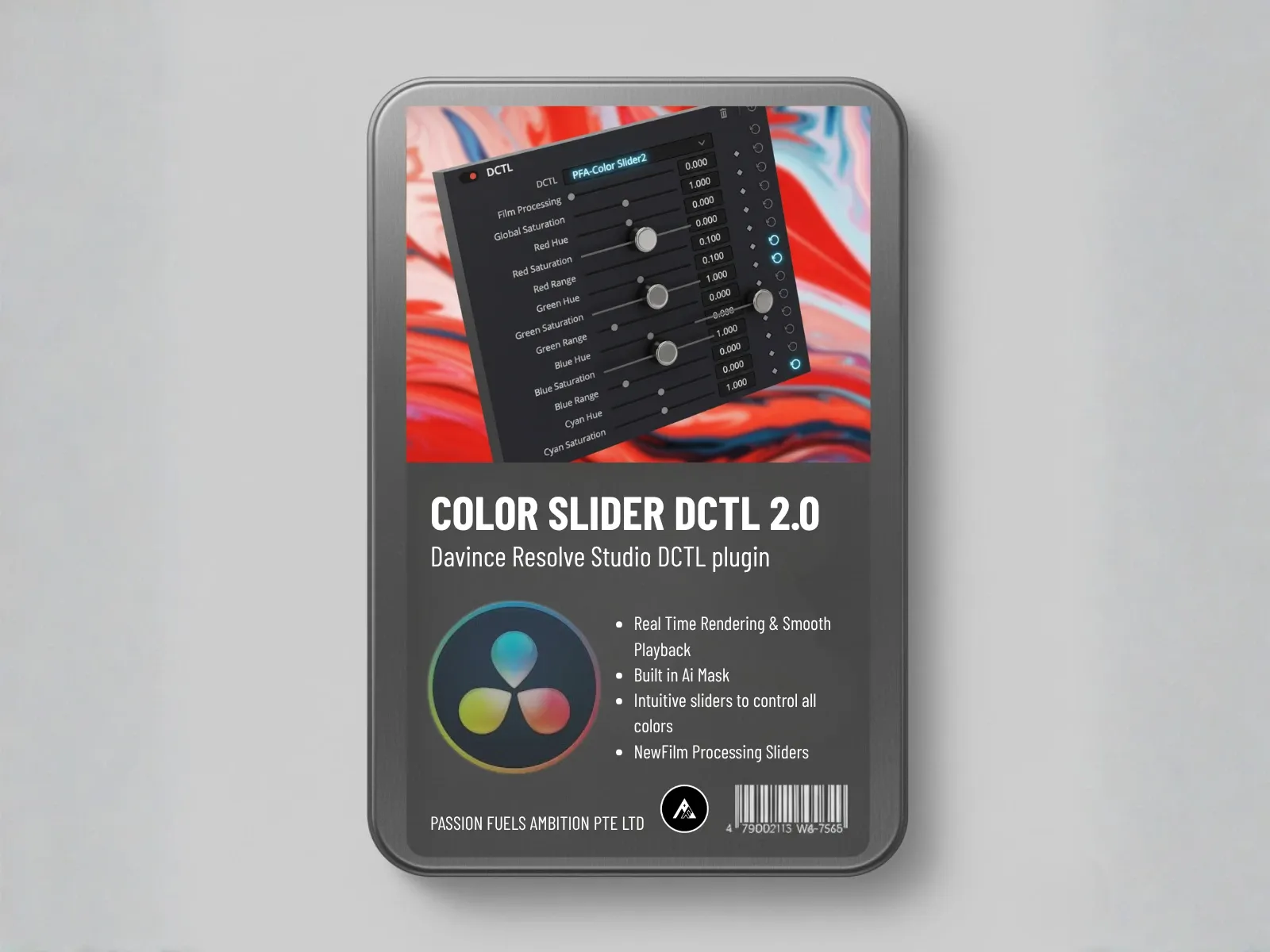
Tool 1: The Color Slider – Analyzing What’s Really There
Press Shift+F to open the full-screen interface. This is where we begin.
The Color Slider is your diagnostic tool. It helps you interpret what’s actually in the image, not what you think is there.
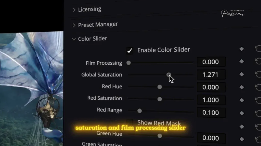
The Step-by-Step Process:
- Bump the global saturation and film processing just to bring out the colors and see what you’re working with.
- Analyze each color channel individually:
- Red? None in this frame.
- Green? None.
- Magenta? Zero.
- Blue? There’s a definite presence here.
- Cyan? This is massive.
- Increase the blue saturation to establish a baseline.
- Push the cyan saturation further up. Now toggle the masking system. It instantly maps the pixels, proving that what looks like one color is actually a precise separation of cyan and blue.
This masking system is crucial. It shows you exactly how the software interprets pixel colors,sometimes what your eye sees as cyan is actually being read as green or yellow. The mask removes the guesswork.
Lock in these adjustments. You’ve now established your base color separation.
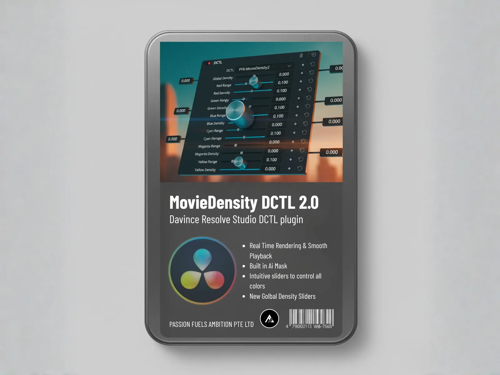
Tool 2: Movie Density – The Hollywood Secret
This is where the magic happens.
If the Color Slider is about interpreting the image, Movie Density is about adding weight to it. This is the hero tool that separates professional cinema from standard video.
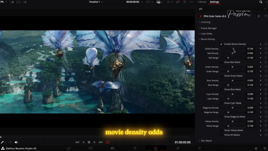
How It Works:
Movie Density uses subtractive color science,the same principle that makes film stock look cinematic. Instead of adding brightness (like saturation), it adds black to the color signal. This creates depth.
The Visual Difference:
- Saturation approach: Push the saturation slider. The image becomes colorful but also bright and flat. The waveform lifts. You get the “thin” digital look.
- Density approach: Drag the Movie Density slider. The color doesn’t just get more vibrant; it gets deeper. It separates from the background. The image gains weight.
Why You Can’t Replicate This with Saturation:
You literally cannot achieve this effect with standard saturation because you’re fighting against the brightness. Density isolates the color saturation and ensures it adds black,not light.
Applying Movie Density to the Avatar 3 Grade:
In the wide establishing shot, I’m adjusting the Cyan and Blue density sliders specifically. I want to separate the foreground spaceship from the background haze.
Watch as I drag the slider. The blue doesn’t just become more saturated; it becomes deeper. It pops forward. The separation is instant and undeniable.
The Precision Tool: Masking System
Toggle on the built-in masking system. This reveals exactly how the software interprets specific pixel colors. Around the spaceship, the mask shows us it’s distinguishing the yellow highlights from the green ambient light perfectly.
We aren’t just qualifying colors; we’re mathematically mapping pixels.
Locking In the Density:
Green is the majority color in this frame, but I want to pop the foreground. So I increase the density of cyan and blue specifically. Just these two sliders create a great separation from the background.
With all this done in just one node, you get that depth. People always ask, “Wow, why does the color look so thick?” The answer is density. It’s the only way to achieve this look.
Tool 3: Film Printer Light – The Organic Color Cast
Now that we’ve established density, we need to dial in the organic film characteristics.
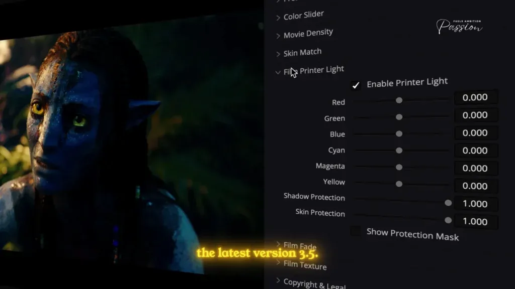
Film Printer Light (introduced in PFA Color Suite 3.5) allows you to manage the global color cast while protecting your shadows and skin tones.
The Color Mixing Theory:
The moment you reduce one color channel, you naturally introduce its opposite. If I pull down the blue channel, I’m not just desaturating blue; I’m mathematically introducing yellow.
Applying This to the Neytiri Shot:
In the character close-up, there’s too much green in the ambient light. I want to reduce the green dominance and introduce a slight yellow shift to mimic that warm afternoon sun hitting her face.
Here’s how:
- Reduce blue slightly
- Increase yellow slightly
- Watch the image warm up organically
This clears out the unnecessary green tint and aligns the shot with that golden hour feel,without destroying the density we built earlier.
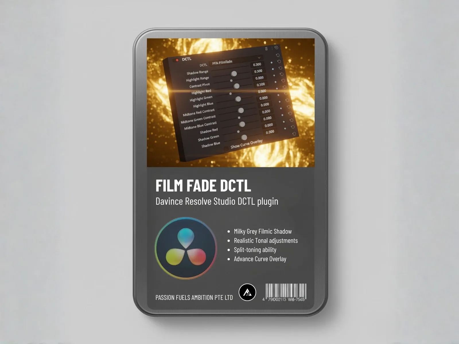
Tool 4: Film Fade – Creating Milky Gray Shadows
This is how we achieve that specific shadow roll-off you see in high-budget cinema.
Digital black is often too sharp, too crushed. Film black has texture to it. Film Fade uses split-toning controls to lift the shadows while keeping the absolute blacks grounded.
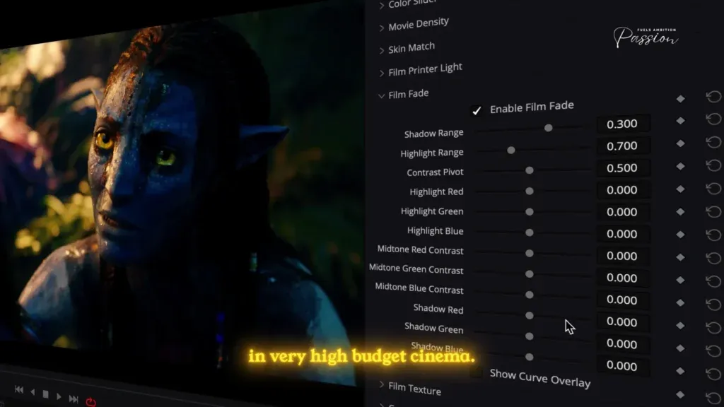
The Critical Distinction:
We aren’t lifting the entire image (which washes everything out). We’re targeting the shadow range specifically.
The Process:
- Lift the shadow slider to create texture
- Look at the waveform,the bottom of the graph lifts slightly, creating that soft toe in the curve
- Optionally, inject a tiny amount of cyan into the shadows to contrast with the warm highlights
This creates color separation based on luminance,a hallmark of the Avatar 3 grade.
The Robustness Test: Does It Work on Other Shots?
Here’s where the PFA workflow proves its superiority over rigid LUTs.
I’m going to copy the entire grade from the wide shot and apply it directly to the close-up of Neytiri. This is the moment of truth for any color workflow.
With a standard LUT: The image would likely fall apart because the lighting conditions are completely different. LUTs are fragile; they’re fixed data points that don’t adapt.
With the PFA one-node workflow: The grade holds up instantly.
However, we need to refine the global balance slightly. Using Film Printer Light, I reduce the green dominance and warm up the image to match the character shot’s lighting. The density remains intact.
Now let’s apply the same grade to the third shot of Kiri. This shot has completely different lighting,it’s softer, more diffused. Yet look at the consistency. The density remains. The cinematic depth is preserved.
Before and After Comparison:
- Left side (Standard Saturation): Bright, digital, looks like video.
- Right side (PFA Density): Thick, cinematic, looks like cinema.
The difference is undeniable. The density separates the character from the background in a way that brightness simply can’t.
The Preset System: Replicability and Flexibility
This is the final advantage of the PFA workflow.
You can save this exact look as a preset within the plugin ecosystem. Unlike a LUT,which is a “dumb” file that you can’t tweak,saving a preset remembers the exact position of every slider.
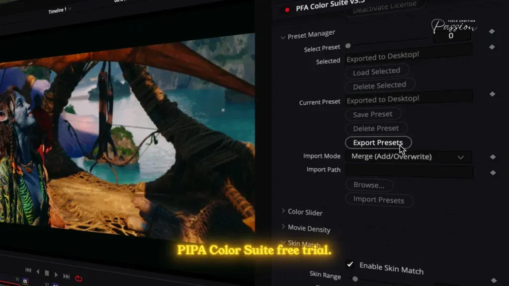
When you apply it to your next scene:
- Back off the density by 10% if it’s too dark
- Shift the Printer Light if the white balance is off
- Adjust individual color channels without losing the overall look
This flexibility is why professional colorists prefer this approach over rigid LUT chains.
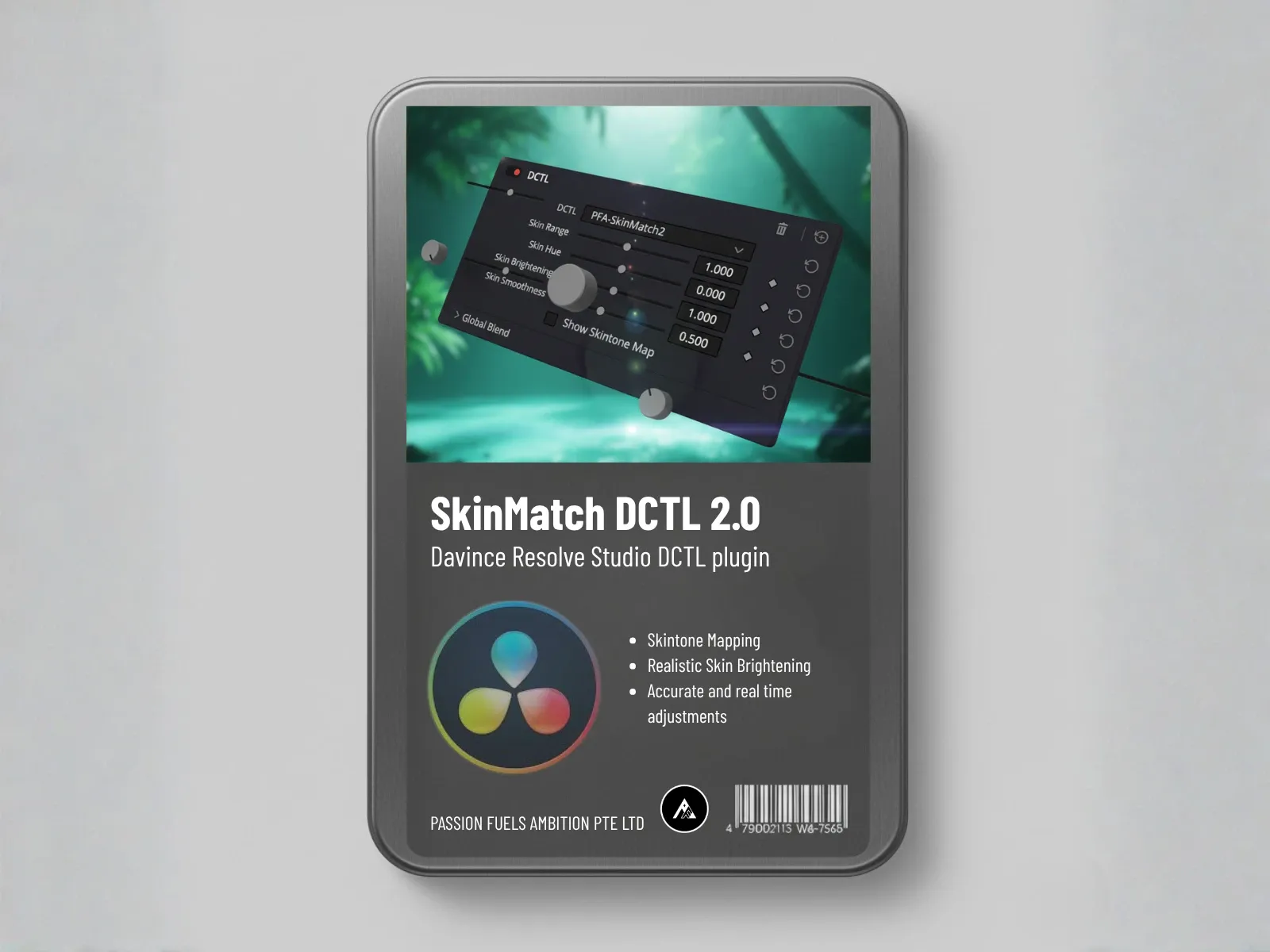
A Note on Skin Tones: Why We Skip the Skin Match AI for Avatar
Normally, this is where I would use the Skin Match AI to perfect the skin tones. However, for Avatar 3, we skip this tool.
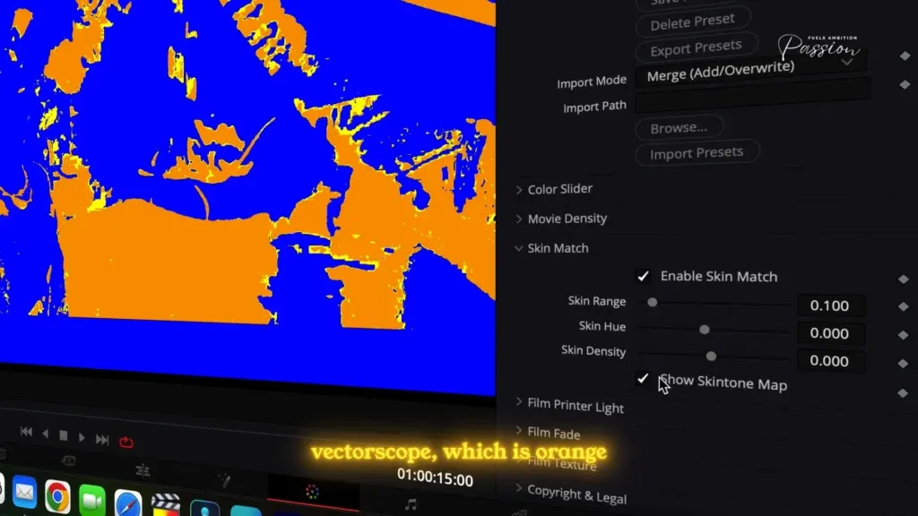
Why? The Skin Tone tool is designed to align pixels to the standard skin tone line on the vectorscope, which is orange/yellow. Since the Na’vi have blue skin, that tool would try to “fix” them by turning them orange.
In this specific case, our density adjustments on the blue and cyan channels have already nailed the skin tone perfectly. Sometimes, the best tool is knowing when not to use a tool.
The Recap: Your One-Node Workflow
Here’s the exact process to replicate on any footage:
- Color Slider: Analyze the image channel by channel. Use the masking system to confirm pixel colors. Establish your base color separation.
- Movie Density: Add weight to your colors using subtractive color science. This is the hero tool that creates cinematic depth.
- Film Printer Light: Manage the global color cast. Warm or cool the image while protecting shadows and skin tones.
- Film Fade: Create that milky gray shadow roll-off. Split-tone if needed for luminance-based color separation.
- Save as Preset: Export your settings so you can apply them robustly to every shot in your project, with minor tweaks as needed.
Why This Matters: The Bigger Picture
The Avatar 3 look isn’t just about making colors pop. It’s about understanding the fundamental difference between how digital tools work and how film works.
Saturation is additive. It makes things brighter and thinner.
Density is subtractive. It makes things deeper and more cinematic.
Once you understand this principle, you can apply it to any footage,whether you’re grading a sci-fi blockbuster or an indie drama. The physics of color don’t change.
Get Started Today: Download the Preset
I’ve exported the exact preset we built in this walkthrough. You can download it and apply it directly to your footage using the PFA Color Suite free trial.
Here’s what you’ll get:
- The complete one-node grade from the Avatar 3 reverse engineering
- All slider positions locked in for immediate application
- Full flexibility to tweak and customize for your specific shots
Next Steps:
- Download the free trial of PFA Color Suite from the link below
- Download my preset (included in the resources)
- Load it into your DaVinci Resolve project and apply it to your footage
- Compare the before and after and see how density transforms your image
The difference will be undeniable.
Final Thoughts
Color grading is often taught as a series of isolated techniques,push this slider, pull that wheel, apply this LUT. But the real skill is understanding why each tool exists and when to use it.
Saturation has its place. But if you want that impossible, thick, cinematic look you see in Avatar 3? You need density.
And now you have the exact workflow to achieve it.
I’m Nash. Passion fuels ambition. Let’s create something impossible together.
Resources & Links
- Download PFA Color Suite Free Trial – Get unlimited access to the full plugin with watermarked output
- [Download My Avatar 3 Preset] – Apply my exact settings to your footage (included with free trial)
- [Learn More About Subtractive Color Science] – Deep dive into the theory behind density-based grading
- [DaVinci Resolve Color Grading Fundamentals] – Master the basics before diving into advanced techniques
About the Author
Nash Yang is a color grading specialist and creator of the PFA Color Suite, a revolutionary one-node color grading plugin for DaVinci Resolve. With a focus on making professional Hollywood techniques accessible to creators of all levels, Nash has helped thousands of filmmakers and content creators elevate their visual storytelling through advanced color science.
Follow Nash:
- YouTube: @nashyangpfa
- Website: Passion Fuels Ambition
How does color grading in DaVinci Resolve recreate the “World of Pandora” look from Avatar: The Way of Water?
Color grading in DaVinci Resolve can recreate the bright and vivid palette of Pandora by using Resolve’s color page tools to isolate hues, tweak shadows and highlights, and apply secondary corrections with character mattes and mattes for selective adjustments. A colorist familiar with the Way of Water can employ node-based workflows, OpenEXR/EXRs for VFX plates, and high-bit-depth EXR or 16-bit TIFF intermediates to retain detail across 4K and stereo 3D deliverables. Combining color correction, creative LUTs or Resolve presets, and a careful color management pipeline preserves the film’s unique color while matching visual effect shots and live-action plates.
What color grading techniques in DaVinci Resolve help integrate VFX and live-action plates?
Integrating VFX requires matching light level, contrast, and grain between elements. Use color grading tools on the color page to align exposure, gamma, and white balance, employ mattes and character mattes for localized corrections, and use OpenEXR EXR sequences to maintain dynamic range. A proper color grading workflow includes timeline conforming, working at high bit depth in Resolve Studio, and collaborating with VFX teams (like Weta or typical post facility pipelines) to ensure distribution masters match Dolby Vision or digital cinema specs.
How do HFR (48fps) and standard 24fps affect the grading process in Resolve?
HFR grading at 48fps versus 24fps primarily affects perceived motion, but the grading workflow remains similar: conform timelines within a single project to the target frame rate, check temporal noise reduction settings for lower light levels, and validate deliverables such as 48fps and 24fps masters. Colorists must ensure consistent color management pipeline and examine motion artifacts in visual effects shots, especially with stereo 3D, while keeping creative intent across frame rates for Dolby Cinema or laser projectors.
Which color grading tools in Resolve are essential for achieving cinematic remaster or DI colorist deliverables?
Essential color grading tools include the primary wheels, curves, qualifier/Power Windows, tracker, node graph, and ACES or DaVinci color management. For DI colorist work, use high-resolution EXRs, apply detail-preserving color correction, and export distribution masters in required formats. Resolve Studio adds advanced noise reduction, GPU acceleration (Blackmagic hardware), and Dolby Vision metadata tools important for Dolby projectors and theatrical remaster workflows.
What is the recommended color grading workflow in DaVinci Resolve for projects with extensive VFX and multiple aspect ratios?
A robust color grading workflow starts with conform and online editorial, then color correct primary shots to neutral, apply creative grade, reconcile VFX plates using EXR sequences, and manage timelines within a single project for each aspect ratio. Keep proxies for online editorial and use full-resolution EXRs and 16-bit TIFFs for final color grading. Coordinate with the post facility and VFX vendors to ensure visual effect shots match grading decisions and remain consistent across deliverables like 4K, Dolby Vision, and various aspect ratios.
How can a colorist use Resolve to preserve bright highlights and deep shadows while keeping a vivid look?
Preserve dynamic range by grading at high bit depth, using lift/gamma/gain and HDR wheels to control shadows and highlights, and employing local grades with Power Windows and mattes to protect skin tones or highlight areas. Use Resolve’s HDR scopes and color management pipeline to balance bright and vivid color without clipping, and leverage film-referred LUTs or custom nodes to craft a unique color while maintaining technical deliverables for digital cinema or Dolby formats.
What are best practices for matching VFX shots and visual effect plates in DaVinci Resolve?
Best practices include working with EXR/openEXR files from VFX vendors, using ID mattes and character mattes provided by compositors, maintaining linear color space workflows, and grading with reference frames. Communicate creative intent with VFX teams (for example, Park Road Post or Weta workflows), check light level and grain matching, and use side-by-side comparison timelines to ensure consistency across the full project from online editorial to distribution masters.
How do presets, grading process, and editing skills factor into professional color grading using Resolve?
Presets and LUTs can accelerate the grade but should be starting points; the grading process relies on a colorist’s craft, understanding of color correction, and editing skills to conform timelines, manage shot continuity, and refine grades. Training in Resolve 17/Resolve Studio and familiarity with color management, Dolby Vision delivery, and tools for high-frame-rate content are essential. Combining technical discipline with artistic sensitivity,the art of color grading,allows video editors and DI colorists to produce remasters and deliverables that respect the director’s creative intent.
Further Reading
- Movie Density Dctl Film Color Depth Subtractive Saturation Tool
- White Paper
- Skinmatch Dctl Ai Powered Skin Tone Calibration For Davinci Resolve
Related: PFA Color Suite | Shop | White Paper | Telegram
FAQ
Do I need PFA Color Suite to follow this tutorial?
While you can achieve similar results with native tools, PFA Color Suite simplifies the workflow significantly. Try the free trial to follow along.
Can I use these techniques in other software?
Yes! The color science principles apply to any grading software, though the specific tools may differ.
📖 Related Reading
Continue your color grading journey:
- Color Grading for Beginners , Complete starter guide
- PFA Color Suite , Professional grading plugin
- CST vs LUT , Technical deep dive
- Shop , DCTLs, LUTs, and resources
- Telegram Community , Connect with colorists